| A mysterious button appears |
As I write this, I still don't know what the icon pictured above signifies, even though I got it from a mobile app that I've used almost once a week for several weeks. The icon is part of a mysterious button that I've been having an internal conflict with.
With the fear of the unknown in my heart, I've stared at the button for weeks, afraid to touch it, afraid to prod and explore, afraid of what it does — it stares right back, its arrow pointing accusingly as if it should be glaringly obvious what it means, making me feel dumb for not knowing. Would pressing it download something to my device? Would it invite all my contacts to the app? Would it share my deepest, darkest secrets to the world?
What could the three dots emanating from a circle signify? A "Share" action, perhaps? Then what does the diagonally pointing arrow mean? Towards what is it pointing?
This button is not alone in tormenting me. The aforementioned app is riddled with nonsensical icons! One time, I had tried to perform some action on the app; I had to play the guessing game to know which of the mysterious buttons performed the action I wanted. I pressed the wrong button and got in trouble for it, broadcasting an unwanted message to contacts, which I immediately tried to delete (I'm glad the app has an easily recognizable "delete" button).
The disadvantages of touch interfaces — the BBM case-study.
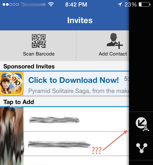
Here is the button again, in context this time (private information blurred to protect the innocent): |
| Mysterious button in context |
I discovered this side-pane by trying to dismiss the sponsored invite. I was unable to remove the invite, but seeing that icon pushed me over the edge to write this post. Prior to this, I had noticed several other buttons within the same app that I had no idea what they did. I took the risk with those buttons. With this, in the context of a sponsored invite, I wasn't feeling adventurous enough to discover what the mysterious button does.
So, I came here to rant.
Touch interfaces, in general, and mobile interfaces specifically, seem to have this problem the most. Mobile touch interfaces need to rely on iconography to present actionable items; using text for every button would take up too much screen real estate. The problem with iconography is that it relies upon shared experiences to remain intelligible to users.
Take the "share" button that is ubiquitous in most apps these days. It is easily recognizable by most users, depending on platform. Android users recognize the universal share symbol for their platform; likewise with iOS users. Most apps share the same share icon (geddit?) on the respective platforms, making it easy for users to identify the action any button marked with that icon would perform.
However, even the ubiquitous share icon has problems, as expanded upon in this article on Fast Company, although I'm not here today to discuss problems regarding universality of icon design.
A share button represents just one of the many varied actions apps of today have to perform, and these apps need icons to represent the action.
This problem is further compounded by the lack of tooltips on mobile interfaces. On traditional desktops, a user could use their cursor to hover over any mysterious icon and some descriptive tooltip would appear and offer enlightenment. This hover mechanism indicates to the system that you may be interested in clicking something. Hovering over a button is like gently prodding it saying to it "Relax and tell me your secrets. Let us get to know each other before we get intimate."
Unfortunately, you can't "hover" on a touchscreen. There is no way for the touchscreen device to know you're interested in a particular button until you've actually pressed the button. On Android, this problem is somewhat alleviated by using a long-press gesture; pressing down a mysterious icon for 2-seconds shows a helpful tooltip. However, this gesture does not work for all buttons.
 |
| Long-pressing a menu button on Android offers some descriptive text |
The BBM app has gotten better over time since its release, but, from a user-experience standpoint, its designers still have quite a bit more to accomplish.
What would be my solution to this problem? Unfortunately, I have none. We would have to wait for a user-experience expert that is smarter than I am to come up with a paradigm that could take out the mystery of icons in a touch-screen interface. My best suggestion: if designing an app for a platform, try to stick with the standard icons that are widely shared between apps on that platform.
In the meantime, if you discover what the mysterious icon represents, please let me know.
Sigh, I know this feeling too well. It can be very disturbing in the sense that your curiosity won't let you settle easily with the fact that you do not know and your fear - usually due to an unfortunate past incident just like the one you mentioned, won't grant you enough courage to explore deep enough to find out. What to do? You've gotta overcome your fear like most situations in life and take the damn leap for knowledge. Well, that is if asking around doesn't help. Good luck and don't forget to educate the rest of us when you do find out.
ReplyDelete